How to Customise Colours, Logos and Design
A core Nucleus feature is the possibility to personalise it with the desired colours, logos and designs. Admin Users can update and change the colours, logos and Favicons at any time and the changes are immediately applied to the site. This guide will cover the following:
- Updating colours
- Adding logos to the Entrant and Viewing Interface
- Adding logos to the finance pdfs
- Updating default email header and footer emails
There are separate guides which cover the following design elements
How to update the Instance Colours
Nucleus now provides a page where Admin Users can update the colours on the Entrant and Viewer Interface. Both interfaces are separate and allow for the provision of different colours, if required, however, admins will need to provide colours for both sections even if identical colours are selected. The page, titled Design Controls, provides 14 controls for the Entrant Interface and 13 controls for the Viewer interface. In each field you will need to provide a Hex Colour Code, which will then be applied to the elements of the site linked to the control – a full list of controls is below. To update the colours:
- Log into the Admin Interface
- Go to Control Centre
- Select Design Controls in the System Administration menu
- Enter the hex values of the colours that require updating into the relevant control fields
- Click Save
- Enter I AM SURE to apply
- Switch to the Entrant/Viewer Interface and refresh the page to see the changes
Note – there is no limit as to the amount of times you update the colours
Design Controls
The table below details the design controls and the elements they update:
Components – Entrant Interface
| Control | COmponent | EXAMPLE | |
|---|---|---|---|
| 1 | Registration Background | The font that appears in the buttons in the dark menu | 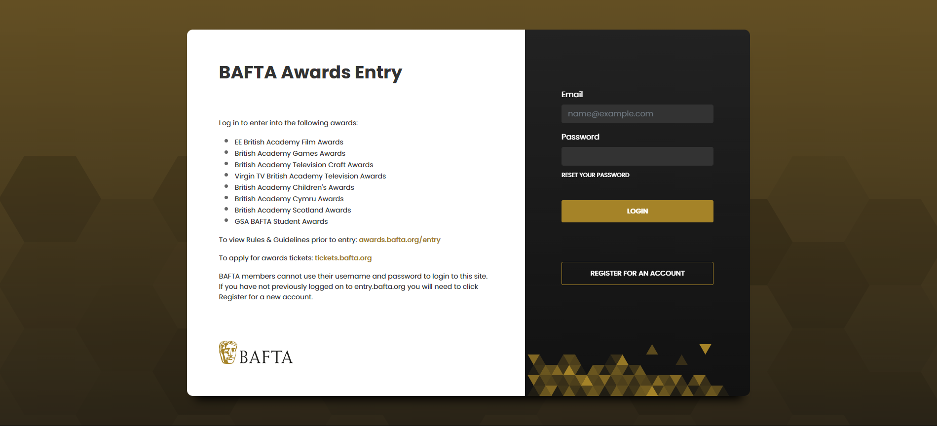 |
| 2 | Registration Background Triangles | Registration Triangles the design should apply a gradient to the colour selected by the client. |  |
| 3 | Registration Feature Colour | There is a colour applied to the selected state of the input fields in the right hand column | 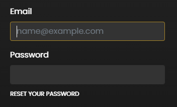 |
| 4 | Registration Feature Colour | Dark Background Primary Button |  |
| 5 | Registration Feature Colour | Dark Background Secondary Outline Button |  |
| 6 | Registration Feature Colour | Registration Timeline | 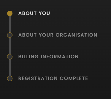 |
| 7 | Menu Colour | Registration Right Column | 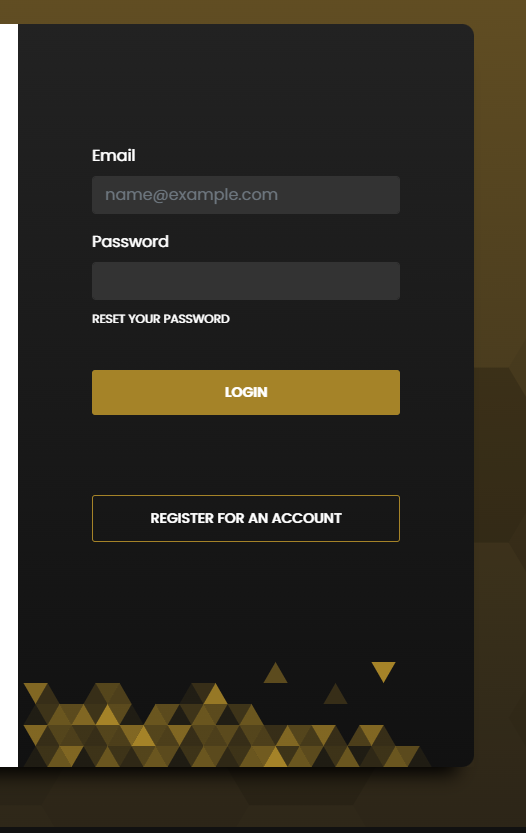 |
| 8 | Menu Colour | Footer bar | |
| 9 | Menu Font Colour | All fonts in the menu and footer, excluding the input fields for email and password | n/a |
| 10 | Menu Colour Hover | Hover State in Menu | 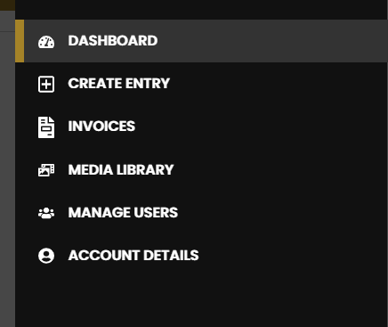 |
| 11 | Dark Background Button Font Colour | Dark Background Secondary Button font |  |
| 12 | Dark Background Button Font Colour | Dark Background Primary Button font |  |
| 13 | Login Page Input Fields | Changes the colours used for the background of the input fields |  |
| 14 | Registration Page Inputs | The colour of the font in the fields |  |
| 15 | Logged in Feature Colour | Contains the main menu and is in the header of each logged in page. |  |
| 16 | Logged in Feature Colour | Listed to the left of each award title on the dashboard |  |
| 17 | Logged in Feature Colour | Create Entry Page Icon | |
| 18 | Logged in Feature Colour | Pagination Menu |  |
| 19 | Logged in Feature Colour | Divider Header Background |  |
| 20 | Logged in Feature Colour | Hyperlink font colour |  |
| 21 | Logged in Feature Colour | Character count font colour |  |
| 22 | Logged in Feature Colour | Picklist Font Colour |  |
| 23 | Logged in Feature Colour | Mandatory Question Colour | |
| 24 | Logged in Feature Colour | Bullet Point Colour |  |
| 25 | Logged in Feature Colour | Main Menu Menu Active colour |  |
| 26 | Logged in Feature Colour | All scrollbars | |
| 27 | Logged in Feature Colour | Page Divider | |
| 28 | Logged in Feature Colour | Calendar select Colour | 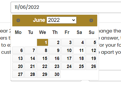 |
| 29 | Logged in Call to Action | The background of the buttons on a light background |  |
| 30 | Logged in Call to Action | Main Menu Logout Button |  |
| 31 | Light Background Primary Button font | Light Background Primary Button font |  |
| 32 | Divider Header Font | Divider Header Font |  |
| 33 | Divider Header Font | Paginated Divider Font |  |
| 34 | Divider Header Font | Hamburger Menu Icon |  |
| 35 | Help Font Colour | Help Text font colour |  |
| 36 | Update Saved | Question highlight colour when the changes have been saved | n/a |
| 37 | Update Saving | Question highlight colour when the changes are being saved | n/a |
| 38 | Update Error | Question highlight colour when there is an error with the save | n/a |
| 39 | Entrant Offline | Question highlight colour when the changes are made when the user is offline | n/a |
| 40 | Entrant Back Online | Question highlight colour when the changes are made when the user is offline and the user is now offline | n/a |
| 41 | Saved by Collaborator | Question highlight colour when another user is editing the form and they have made a change | n/a |
Components – Viewer Interface
| CONTROL | COMPONENT | EXAMPLE | |
|---|---|---|---|
| 1 | Registration Background | The design applies a hexagonal gradient of the colour selected by the client |  |
| 2 | Registration Background Triangles | Registration Triangles the design should apply a gradient to the colour selected by the client. |  |
| 3 | Registration Feature Colour | There is a colour applied to the selected state of the input fields in the right hand column |  |
| 4 | Registration Feature Colour | The background colour of the button in the dark menu |  |
| 5 | Menu Colour | Registration Right Column |  |
| 6 | Menu Colour | Footer | |
| 7 | Menu Font Colour | All fonts in the menu and footer, excluding the input fields for email and password. | |
| 8 | Menu Colour Hover | The hover background for menu items |  |
| 9 | Dark Background Button Font Colour | Dark Background Primary Button font |  |
| 10 | Login Page Input Fields | Changes the colours used for the background of the input fields |  |
| 11 | Registration Page Inputs | The colour of the font in the input fields |  |
| 12 | Logged in Feature Colour | Contains the main menu and is in the header of each logged in page. |  |
| 13 | Logged in Feature Colour | Page Divider | |
| 14 | Logged in Feature Colour | Divider Header Background |  |
| 15 | Logged in Feature Colour | Hyperlink font colour |  |
| 16 | Logged in Feature Colour | Bullet Point Colour |  |
| 17 | Logged in Feature Colour | Main Menu Menu Hover Colour – stripe |  |
| 18 | Logged in Feature Colour | Search icon |  |
| 19 | Logged in Feature Colour | Category Box Header | 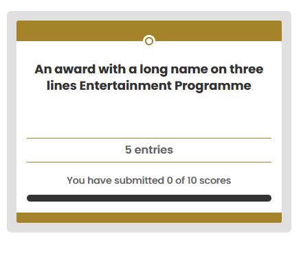 |
| 20 | Logged in Feature Colour | Category Box Footer |  |
| 21 | Logged in Feature Colour | Category Box Line |  |
| 22 | Logged in Call to Action | Light Background Primary Button |  |
| 23 | Logged in Call to Action | Main Menu Logout Button |  |
| 24 | Light Background Primary Button font | Light Background Primary Button font |  |
| 25 | Divider Header Font | Divider Header Font |  |
| 26 | Divider Header Font | Paginated Divider Font |  |
| 27 | Logged in Call to Action | Light Background Primary Button |  |
| 28 | Logged in Call to Action | Main Menu Logout Button |  |
| 29 | Divider Header Font | Hamburger Menu Icon |  |
| 30 | Divider Header Font | Divider Header Font |  |
| 31 | Divider Header Font | Paginated Divider Font |  |
| 32 | Divider Header Font | Hamburger Menu Icon |  |
How to update the Logos for the Entrant and Viewer Interface
Nucleus now provides a page where Admin Users can update the logos on the Entrant and Viewer Interface. Both interfaces are separate and allow for the provision of different logos, if required. However, Admins will need to provide logos for both sections even if identical colours are selected.
Before you add a logo you will need to make sure the image is hosted on a website, for example, a WordPress Media Library with a publicly accessible URL. It is not possible to upload images directly to Nucleus but images with a link can be applied. If you do not know html code then we recommend that you resize the image to the required size before you upload. svg, png and jpeg files are accepted.
- Log into the Admin Interface
- Go to Control Centre
- Select Design Controls in the System Administration menu
- Locate the following fields and past in the logo url:
- Logo Header URL – controls the logo used for all logged in pages in the header
- Logo Login Page URL – controls the logo used on the login page and password reset process
- Click Save
- Enter I AM SURE to apply
- Switch to the Entrant/Viewer Interface and refresh the page to see the changes
Note – there is no limit as to the amount of times you update the logos
How to Add a Logo to the Finance pdfs
Nucleus allows Admins to provide a custom logo, per instance, for the invoice, receipt and credit note PDFs. Before you add a logo you will need to make sure the image is hosted on a website, for example, a WordPress Media Library with a publicly accessible URL. It is not possible to upload images directly to Nucleus but images with a link can be applied. If you do not know html code then we recommend that you resize the image to the required size before you upload. Ensure the height does not exceed 150 px and width 500 px.
- Log into the Admin Interface
- Go to Control Centre
- Click Design Controls in the System Administration Menu
- Scroll down find Invoice Paperwork Logo URL in the Entrant Interface section
- Paste the URL in to the text area
- Click Save
- Type I AM SURE and then click OK
- To test the paperwork go to Actions>Awards and click edit. Scroll to the bottom of the page and in the Test Paperwork section click on pdf to review the logo in the documents
How to Update the Default Header and Footer Email Logos
All email templates have an option to include a standard header and footer. This is a logo that admins can set on the design control page that will automatically be printed above and/or below the email content. For more information about setting up email templates read the help guide. This section will explain how to set the email logos.
You will first need to allow the use of standard header and footer from the email templates.
- Log into the Admin Interface
- Go to Email Management
- Click on Email Templates under the Email Management section
- Look for the relevant Email Template and click on Default
- Set the “Include standard header and footer” question to Yes
- Click Save & Close
- Repeat steps 3 – 6 for all the email templates required
Once you have actioned this, you can add the standard header and footer URL:
- Go to Control Centre
- Click Design Controls in the System Administration Menu
- Scroll down find Email Header URL and Email Footer URL
- Paste the logo URL in to the text areas as required
- Click Save
- Type I AM SURE and then click OK
- The new images will be included for any newly generated emails that have bene set to use the header and footer
For all instances launched before December 2022 an image file would have been requested and hard coded to be used as the email header. This file is still used unless you decide to replace it with another. To use the default file enter _default_ into the text areas. This is the default answer.